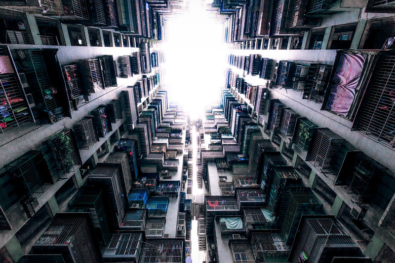
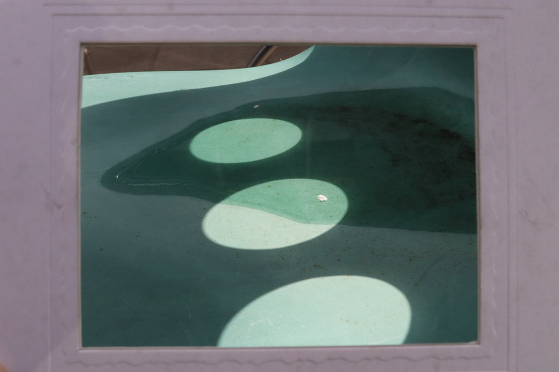
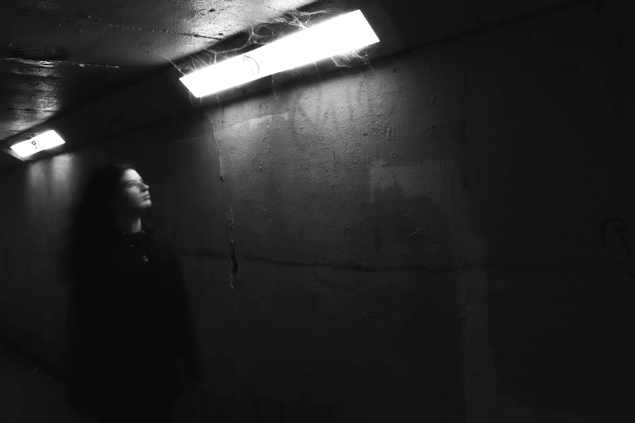
looking up
Inspiration -
ANDY YEUNG
ANDY YEUNG
Andy Yeung is a young Chinese photographer who focuses on landscape, architecture and aerial photography, taking inspiration from his surroundings in Hong-Kong. His work has been exhibited in there and in Los Angeles, also being mentioned in an array of prestigious media, including; Lonely Planet, Daily Mail, National Geographic, CNN, BBC as well as many others.
These visually amazing images are in his recent series 'Urban Jungle' and have attracted international attention.
Yeung's famous motto "always look up" is portrayed very well here, and has been the source for our inspiration.
These visually amazing images are in his recent series 'Urban Jungle' and have attracted international attention.
Yeung's famous motto "always look up" is portrayed very well here, and has been the source for our inspiration.
|
|
|
Our brief was to create a series of dramatic images of buildings, photographing them from a worm’s eye view. This angle is used to create the illusion of a never-ending path up to the clouds, also making you feel smaller then you actually are.
We were specifically asked to pay attention to the the cropping of our image, and assuring the ISO is set to a minimum of 400. Also to experiment with different edits and angles/crops.
We were specifically asked to pay attention to the the cropping of our image, and assuring the ISO is set to a minimum of 400. Also to experiment with different edits and angles/crops.
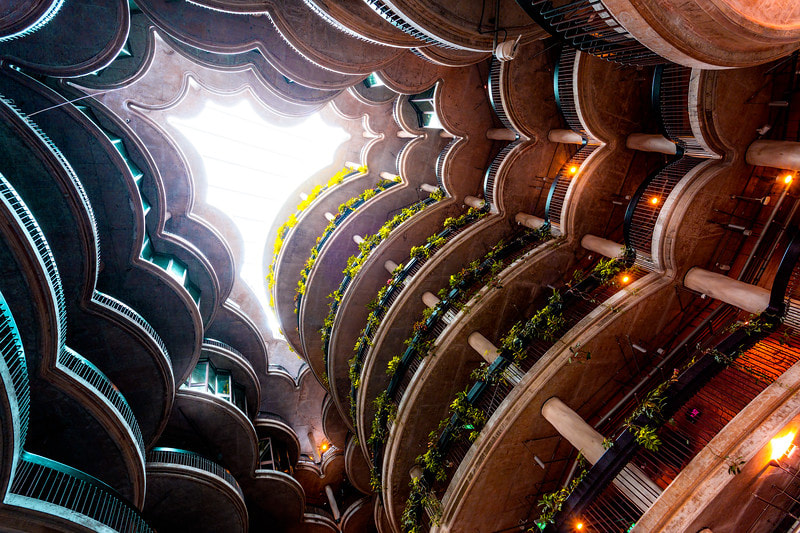
FIRST ATTEMPT
WWW - I think these are visually very interesting images, a good first response to test and see what works best with this style of shooting. Also I think the images have lots of dimension and texture.
EBI - It doesn't quite fit the original brief and in some of the images the sky is very bright because the ISO is too high, this could be improved with editing.
EBI - It doesn't quite fit the original brief and in some of the images the sky is very bright because the ISO is too high, this could be improved with editing.
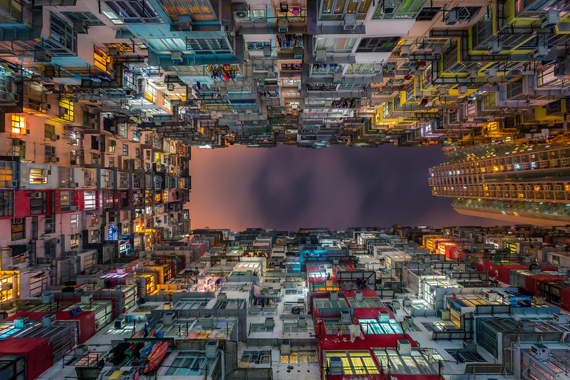
SECOND ATTEMPT
WWW - I think these images fit the original brief much better, they are more precise and creative with better lighting and composition.
EBI - Some of the pictures are slightly boring, although I think simplicity works with some of them. If I was to do this task again I would have gone into London and shot new buildings. My idea for this shoot was to use natural environments in contrast to urban life. However, I don't think it quite works for this style.
EBI - Some of the pictures are slightly boring, although I think simplicity works with some of them. If I was to do this task again I would have gone into London and shot new buildings. My idea for this shoot was to use natural environments in contrast to urban life. However, I don't think it quite works for this style.
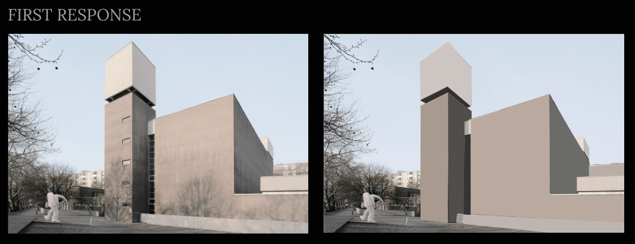
reflective STRUCTURE
This project is continued from Andy Yeungs work where the images are so symmetrical they look like refections.
We tried to recreate this using Photoshop's reflection tool.
We tried to recreate this using Photoshop's reflection tool.

|

|

|
PROCESS -
PRODUCT

|

|
WWW - I really like both of these edits, they reflect well and capture Andy Youngs effect. The dimensions and shapes that are created are also interesting.
EBI - The image on the left could have been slightly more precise with symmetry, but this has made it look more 3D which I like.
EBI - The image on the left could have been slightly more precise with symmetry, but this has made it look more 3D which I like.
COMPOSITION
Photo composition is how a photographer arranges visual elements within their frame.
“It's a pleasing organisation of objects within your rectangle,” - Adam Long, professional photographer
DEFINITION - Composition is the arrangement of shapes (or forms) in an image, relating to their position, relationship to one another and to the image as a whole.
Photographers, like other artists, compose their images to create certain effects and to affect the viewer.

Jaroslav Rossler - Untitled. Petrin Tower 1924-26
|

Berenice Abbot - El at Columbus Avenue and Broadway1935-39
|
RULE OF THIRDS

The rule of thirds in photography is a guideline that places the subject in the left or right third of an image, leaving the other two thirds more open. It divides a photo into nine equal parts, split by two equally spaced horizontal and vertical lines.
PHYSICAL RESPONSE


|


|
|
RULE OF THIRDS

LAYERS

|
BALANCE

TRIANGLES

|
WWW - I was successful in finding interesting shapes and angles, as well as vibrant colours to bring out the composition of the images. In particular I really like the layers image, the tree in the back is for me the centre of the photo, but you have to look through the blurry walls and windowsills to find it. The tree also appears very green compared to the other objects, exaggerating the contrast between nature and urban.
EBI - The lighting is a bit basic in all the the images, also I feel that balance and rule of thirds are unrefined and could be better.
EBI - The lighting is a bit basic in all the the images, also I feel that balance and rule of thirds are unrefined and could be better.
PHOTOJOINERS
Inspiration -
DAVID HOCKNEY
DAVID HOCKNEY


David Hockney (1937-) is an English artist, and is best known for his pop art paintings. We took inspiration from his photojoiner work. This is when he takes a photo of a landscape or scene from different angles and then edits them together imperfectly, with the images overlapping. The way that the images are not in the 'correct' places creates an other worldly or dreamy effect.
We attempted this with a chair as our main focus, copying the style in which Hockney edits his pictures. The result is below.
WWW - I completed the task well and I like the image placement as it is abstract.
EBI - But the image is a bit plain, and I'd like to make the background a colour corresponding to the colours in the image. As well as this the image placement could be more interesting.

process -


photojoiners 2nd response
I think that this image is much more interesting to look at, I changed the colour of the background to match the colour code and made the image placement more abstract and interesting to view.

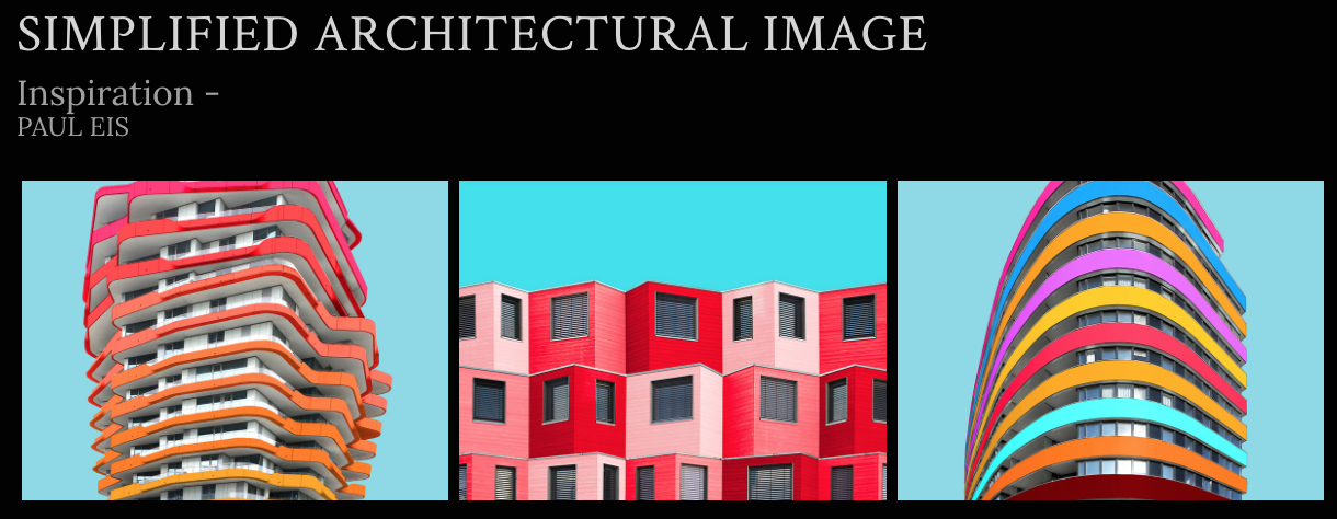
Paul Eis (1998-) is an Austrian photographer. He captures simple architecture and then edits the block colours to make the image more exiting to look at, which are usually plain greys and browns, into bright, bold colours which bring out the shapes of the buildings and draw your eyes to the image.
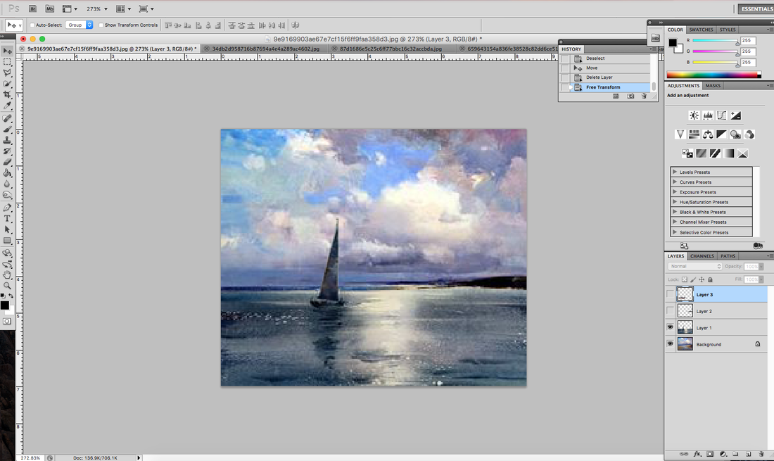
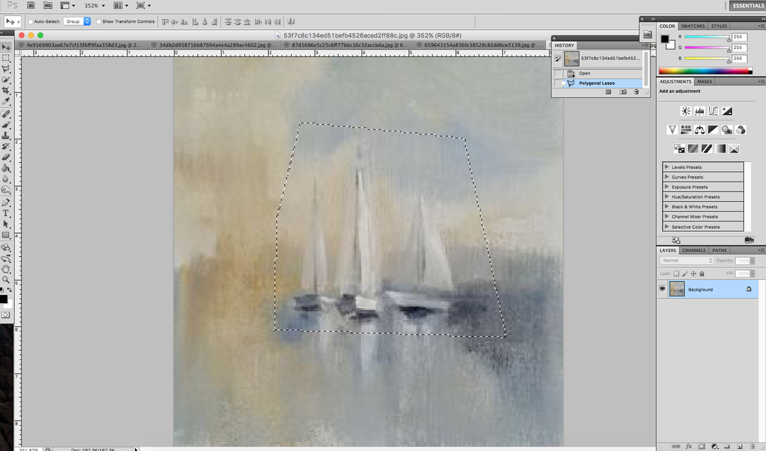
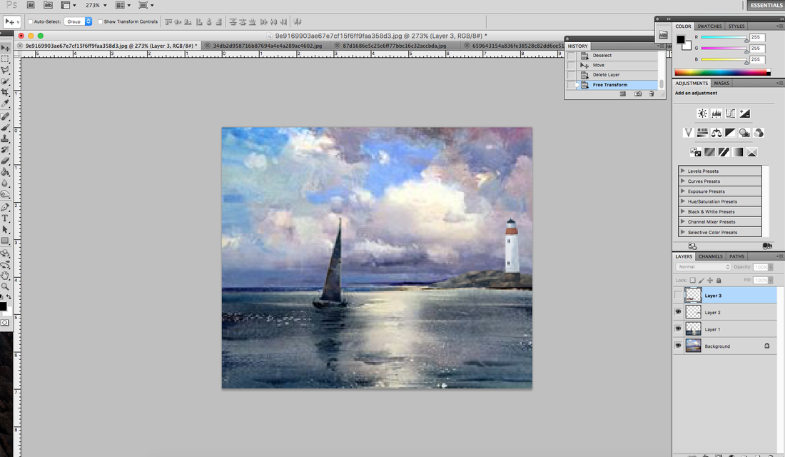
We took inspiration from this and tried to recreate the same thing in the edits below. Using photoshops lasso tool to select specific parts of the image and turn them to block colour using the paint bucket to fill in the selected space.
WWW - Task was completed well and I selected colours to correspond with the shadows.
EBI - Lines could have been neater and more precise, and I could have edited out background and details.


The colours correspond well, as they are on opposite ends of the colour wheel. I used a slightly darker red from the side of the building where the light wasn't hitting, to give it more depth. But the front edges are slightly parted, that is something I could improve on as it happened in my previous response.
FRAMING THE ENVIROnMENT
Inspiration -
JOHN DIVOLA
JOHN DIVOLA

|

|

|
John Divola (American, b. 1949) is a photographer who influenced changes to the Contemporary style of art. Divola was born and raised in the Los Angeles area, and graduated with a BA from California State University in 1971. He studied at the University of California and completed an MFA degree in 1974.
We took inspiration from his late 1970s work, where he used windows to frame the background behind. We replicated this with wildlife and a card frame to focus on specific aspects of an image. |
TOP 3
|

|
|

|
|
|
If I were to do this task again I might have focused on light more and how I shot the images, in terms of angles because in this shoot all of the pictures were shot with a frontal view. But I do like how focused they are and how colours are captured well.
WILD CONCRETE
Inspiration -
ROMAIN JACQUET-LAGEZE
ROMAIN JACQUET-LAGEZE
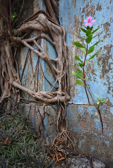
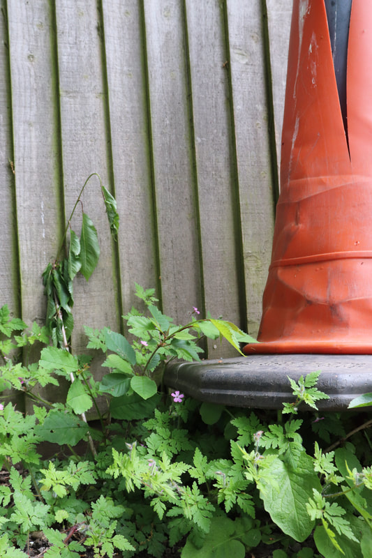
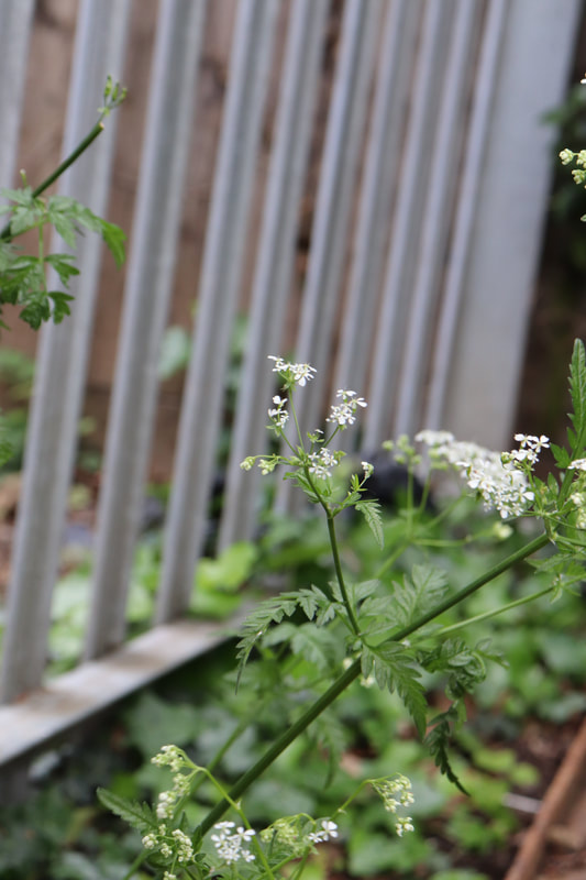
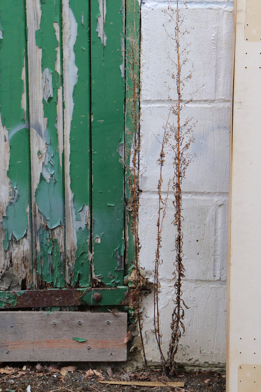
Romain Jacquet-Lageze is a French photographer based in Hong Kong. Since 2010 he has been pointing his camera on the city to document the secret and different aspects of it. He focuses on the idea of wildlife slowly making its way back into the urban 'jungle' as it has been pushed back out for so long. He looks for interesting shapes within vines/leaves/roots, and searches for derelict places to capture this intriguing imagery.
As well as this, the heart of his work is often the divide between nature and humans. We used this as inspiration for this photography assignment, searching for imperfections in the enviroments around us.
As well as this, the heart of his work is often the divide between nature and humans. We used this as inspiration for this photography assignment, searching for imperfections in the enviroments around us.
|

|

|
FIRST ATTEMPT
TOP 3
|

|
|
WWW - I think the brief was met well and I used interesting angles to show off the plants within the concrete.
EBI - The lighting is a bit boring and is the same in all the photos, if I were to do it again I would try and use artificial light to create a different effect. Also maybe use different composition, I think the way I've done it doesn't really tie with the artist.
EBI - The lighting is a bit boring and is the same in all the photos, if I were to do it again I would try and use artificial light to create a different effect. Also maybe use different composition, I think the way I've done it doesn't really tie with the artist.
SECOND ATTEMPT
TOP 3
|

|

|
WWW - I love these photographs, the composition is unusual and the colours pop in all of the images because of the contrast and the background.
EBI - Again the lighting is a bit plain but I think it echoes the style of the artist as he doesn't use many bold shadows or highlights.
EBI - Again the lighting is a bit plain but I think it echoes the style of the artist as he doesn't use many bold shadows or highlights.
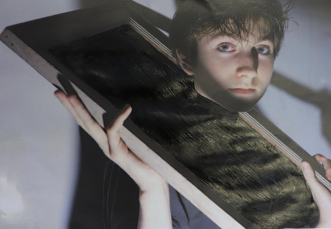
LAYERED LANDSCAPE
Inspiration -
SUN LI
SUN LI
|

|
|
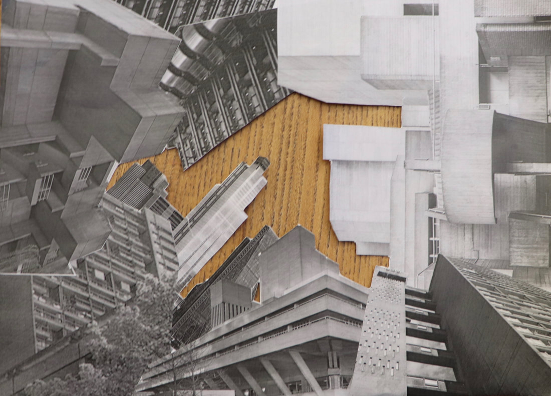
Shanghai-born artist, Sun Ji, creates intricate photo collages that combine old and new buildings for a dystopian effect.
In one work from his “Memory City I” series, Sun juxtaposes black-and-white photographs of factories, homes and unusual architecture. He layers the stolen images in Photoshop. From a distance the collages look like real photographs but when you look closer you realise that they have another dimension.
We tried to recreate this in Photoshop, my fist attempt in below.
FIRST RESPONSE

WWW - I created a layered image with interesting elements and sizes.
EBI - The editing could have been better, the images are a bit choppy and don't look like they belong together. I can solve this by resizing some of the images and possibly changing the edit to landscape.
EBI - The editing could have been better, the images are a bit choppy and don't look like they belong together. I can solve this by resizing some of the images and possibly changing the edit to landscape.
SECOND RESPONSE
|
|
|
|

WWW - I like this edit because I think it is different to the original brief but it still works well, I think the different images work together as a whole and they do look like they belong together.
EBI - Colour matching is still an issue, the sea is too dark, maybe add a reflection in to make it seem more realistic.
EBI - Colour matching is still an issue, the sea is too dark, maybe add a reflection in to make it seem more realistic.
PHYSICAL RESPONSE
In this task we are asked to create a physical representation of a layered landscape.
Using printed B&W printed images we cut out buildings and layered them physically, I decided to arrange my buildings in a way that seemed like you were looking upwards, partly inspired from our "Looking up' work.
I think the collage turned out well, the images correspond well and the shadows match, I also think it is more interesting than organising it from one angle. However I think my editing could be improved it is a bit choppy and I am not sure black is the right colour.
|
|
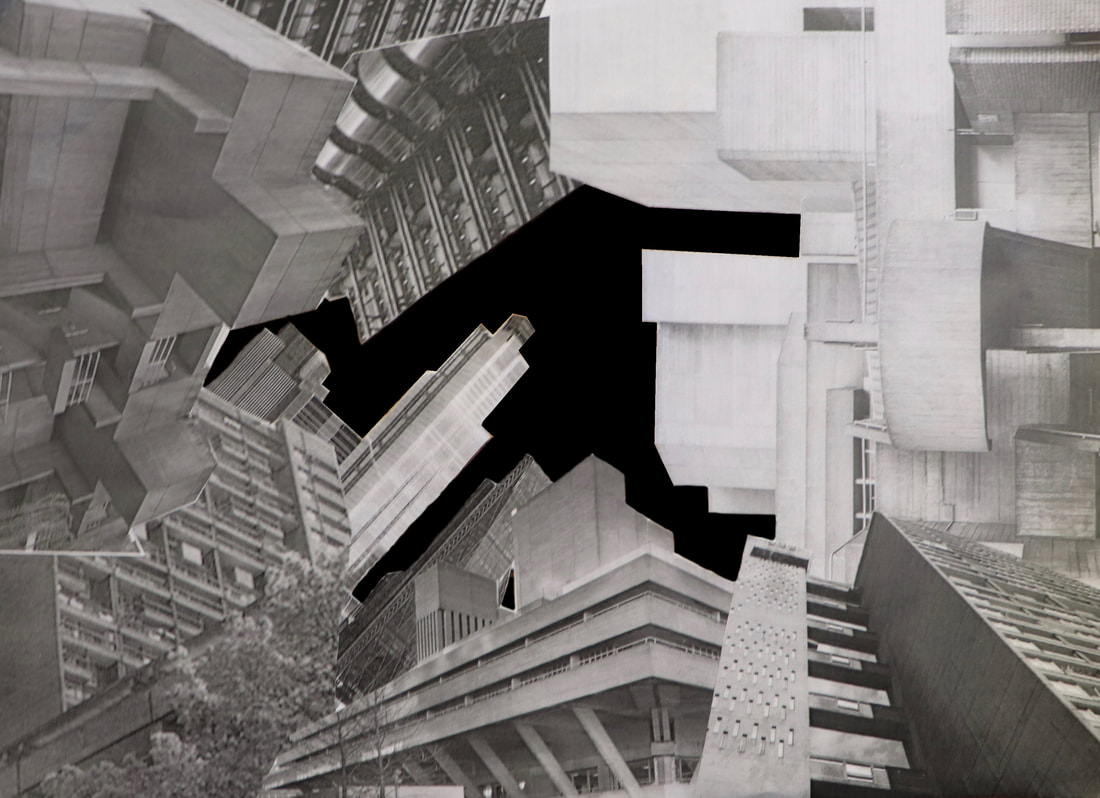
HALF-TERM WORK
In this task we were asked to find and capture unique, old and new buildings.
I went into London during my Half-Term break and found these buildings in the centre, exhibited in a slideshow below. My top images with description are below that.
-
I went into London during my Half-Term break and found these buildings in the centre, exhibited in a slideshow below. My top images with description are below that.
-
- Images 7/8/9 is The White Tower, Hidden down a small street in Farringdon, this is the only house in the City of London to have survived the Great Fire Of London in 1666. Built between 1597 and 1614, it is one of the oldest buildings in London.
UNIQUE
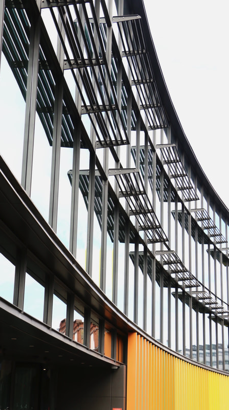
Eco Building, Camden - Hawley Crescent
OLD
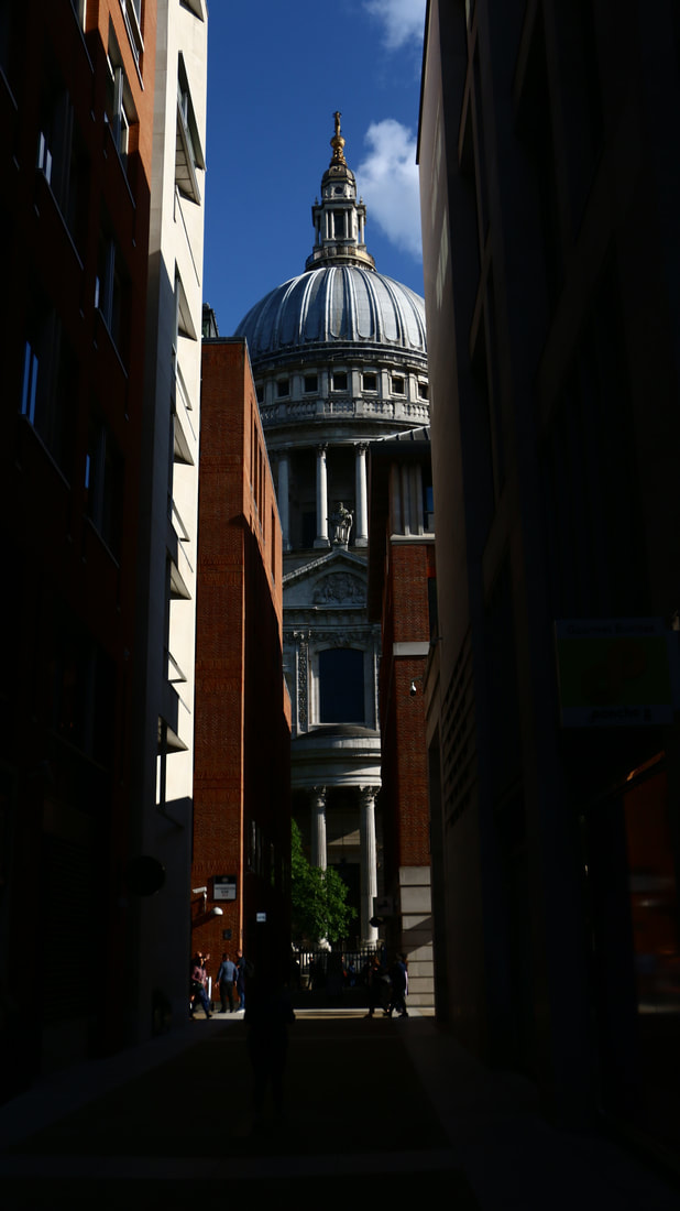
St. Pauls Cathedral
MODERN
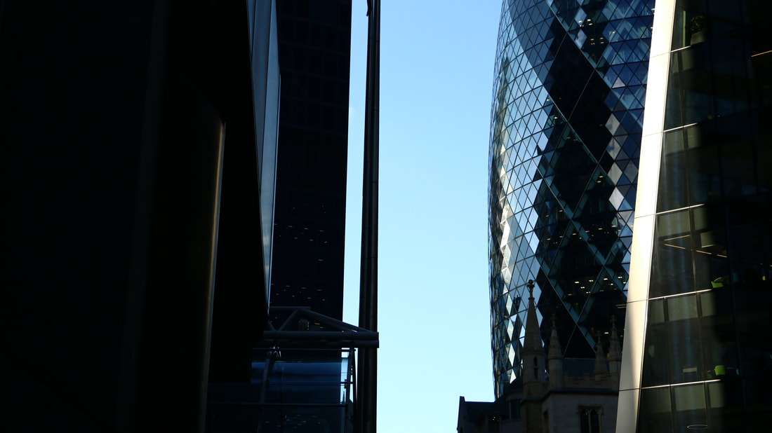
Gherkin - St Marys Ave
DEVELOPMENT
Inspiration -
Eugene Richards (The Blue Room)
Eugene Richards (The Blue Room)
|
|

|
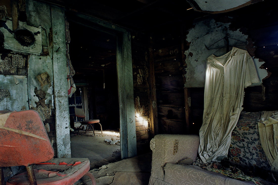
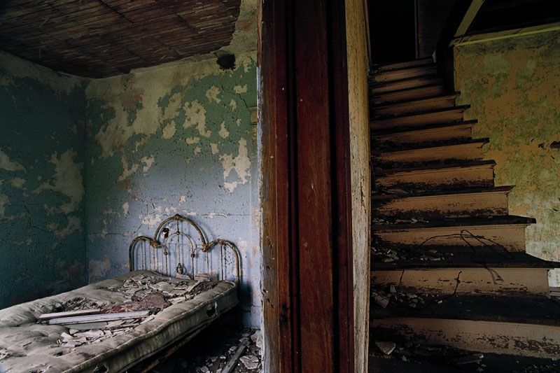
Eugene Richards (1944) is one of America's greatest living social documentary photographers. His intense vision and commitment to documenting the disadvantaged has produced powerful work on topics such as drug addiction, poverty, the mentally disabled, ageing and the personal consequences of war.
The Blue Room is his first colour project, is what he describes as the 'transient nature of things'.
The photographs are portraits of the abandoned and forgotten houses of western America in areas such as the plains of Kansas, Nebraska, New Mexico and the Dakotas.
I found the atmosphere of his abandoned places particularly intriguing - a good base for my development.
GOOGLE INSPIRATION

Browsing for ideas on Pintrest, this image really stood out to me.
Giving me ideas about using models to enhance my work.
-
Using people to create atmosphere.
Giving me ideas about using models to enhance my work.
-
Using people to create atmosphere.
FIRST ATTEMPT
This was a starting shoot. I went to Parkland Walk because I thought of the arches and overgrown nature, similar to my first impressions of wild concrete from Romain Jacquet-Lageze.
My photos didn't have a story, they were just static and similar to my inspiration, which I didn't like.
I really love Eugene Richard's work, and the idea of abandoned buildings as 'Wild (derelict) Concrete'. My problem is that I can't find anywhere special to go to, but then do I really need anywhere special?
I just need somewhere with atmosphere.
Following this, I thought of my local places, Alexandra Palace for example. Somewhere with lots of history and tragedy.
This led me onto the idea of ghosts/lost souls/innocent lives. I could use a long exposure to create ghostly images with an interesting background, the effect of decay and how it come back, but not in the way you'd expect it to.
For setting, I also love the aesthetic of tube stations, which lead me to the idea of abandoned underground subways. Hazy lights and dirty unkept walls.
My new inspiration is below.
Inspirations -
ALAXEY TITARENKO

|

|

|
Alexey Titarenko was born on Vassilievsky Island in Leningrad (now St. Petersburg) in 1962.
In 1983, Titarenko received a Master's degree in Cinematic and Photographic Arts from the Leningrad Institute of Culture. Prevous experiance of millitary service.
After the collapse of the Soviet Union in 1991 he produced several series of photographs about the human condition of the Russian people during this time and the suffering they endured throughout the twentieth century. To illustrate links between the present and the past, he created powerful metaphors by introducing long exposure and intentional camera movement into street photography. The most well known series of this period is City of Shadows.
Titarenko’s prints are subtly crafted in the darkroom. Bleaching and toning add depth to his nuanced palette of grays, rendering each print a unique interpretation of his experience and imbuing his work with a personal and emotive visual character.
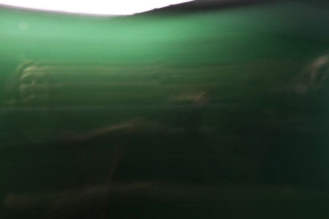
Nick Fancher is a dramatic photographer who plays with bold colours and experimental lighting. He studied photography at Ohio State University and has written books on his camera techniques including Studio Anywhere 1 & 2 and Chroma.

|
|

|
PRACTICE SHOOTS
As you can tell these were my practice shoots. It took a while to get the lighting and shutter in the right place, some of the images above are overexposed but I managed to fix it.
During my second shoot I experimented with a different lens and added filters to block out light but also to change the colours, it was interesting to see how that changed the image. The blue colour created a dreamy effect which I really love.
During my second shoot I experimented with a different lens and added filters to block out light but also to change the colours, it was interesting to see how that changed the image. The blue colour created a dreamy effect which I really love.
SECOND FIRST RESPONSE
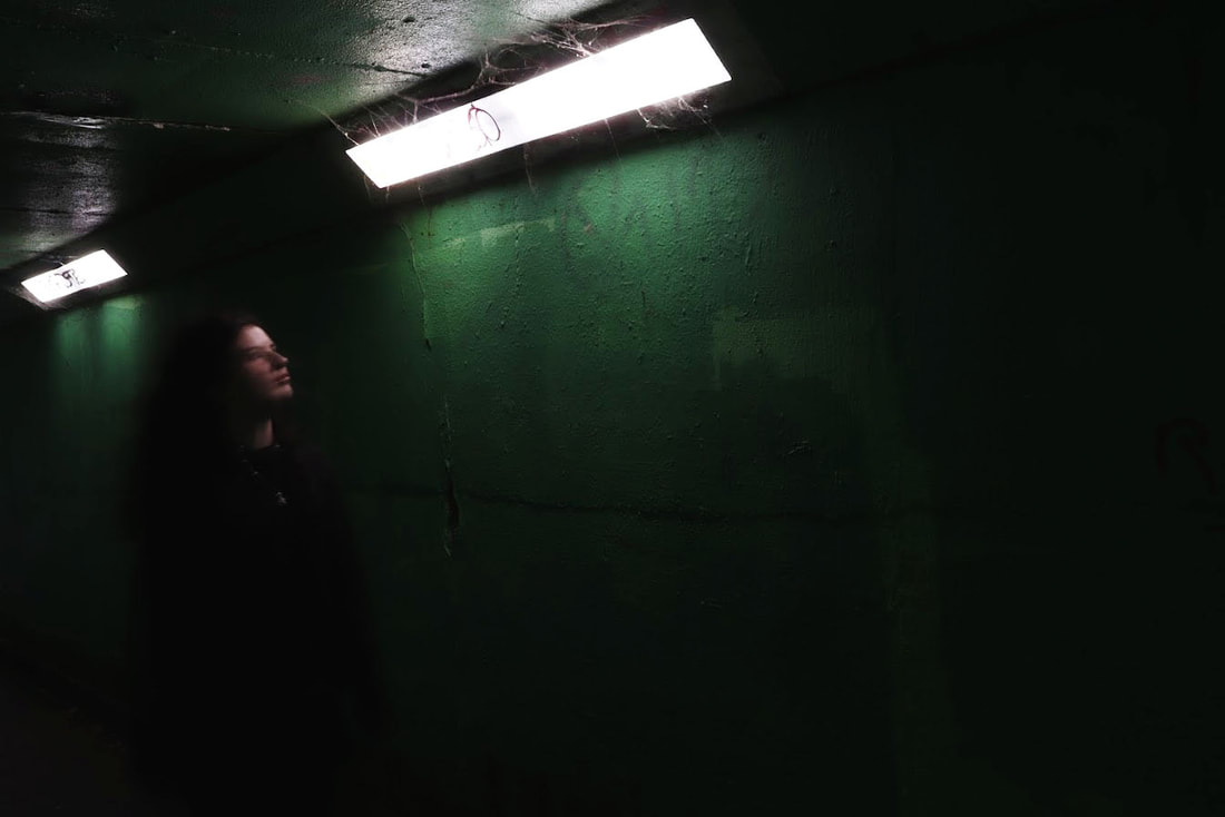
I chose this location in Parkland walk because I think it had an odd atmosphere, which was exactly what I looking for.
The graffitied green walls and dirty subway lights create a sense of unease and neglect, the idea was to create a ghostly light effect within this.
I used the lights in the slow shutter images to create lines and shapes in the pictures, also as a still as a contrast to the moving model.
I really like these images, I achieved what I wanted and loved the ghostly effect. If I were to do it again the lighting could be improved and also the angles are very basic.
EDITED


|

|
SECOND RESPONSE
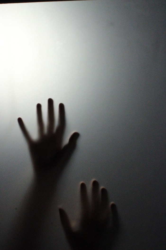
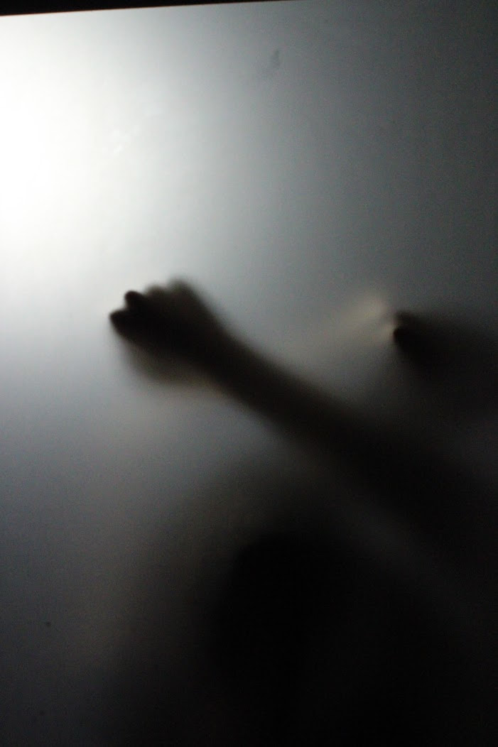
KEYWORDS + ideas
plastic
shadows
trapped
trapped souls
zombie?
emotion
hands
the upside down
shooting in film?
distorting the film in water?
plastic
shadows
trapped
trapped souls
zombie?
emotion
hands
the upside down
shooting in film?
distorting the film in water?
PINTREST INSPIRATION

|

|

|
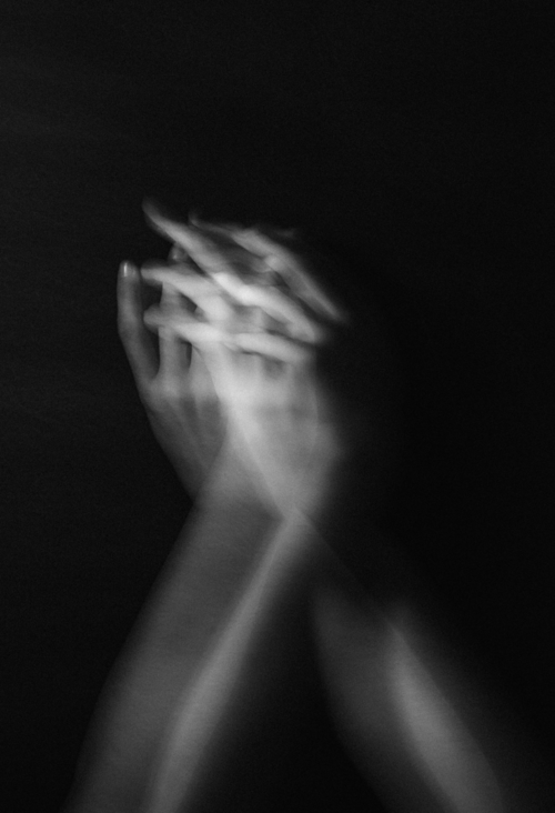
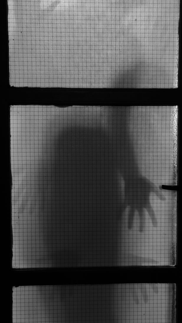
These images do not directly link to an artist, but I love how spooky they are, and the sense of being trapped.
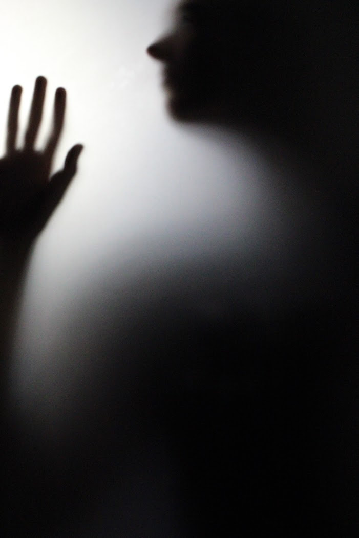
My attempt at a recreation is below, I used a large piece of tracing paper attached to a stand and then a bright studio light behind to create shadow. My model pressed parts of her body onto the paper to create crisp details.
My attempt at a recreation is below, I used a large piece of tracing paper attached to a stand and then a bright studio light behind to create shadow. My model pressed parts of her body onto the paper to create crisp details.
TOP 3
|
|
|
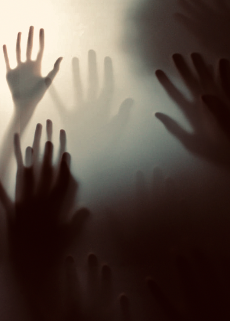
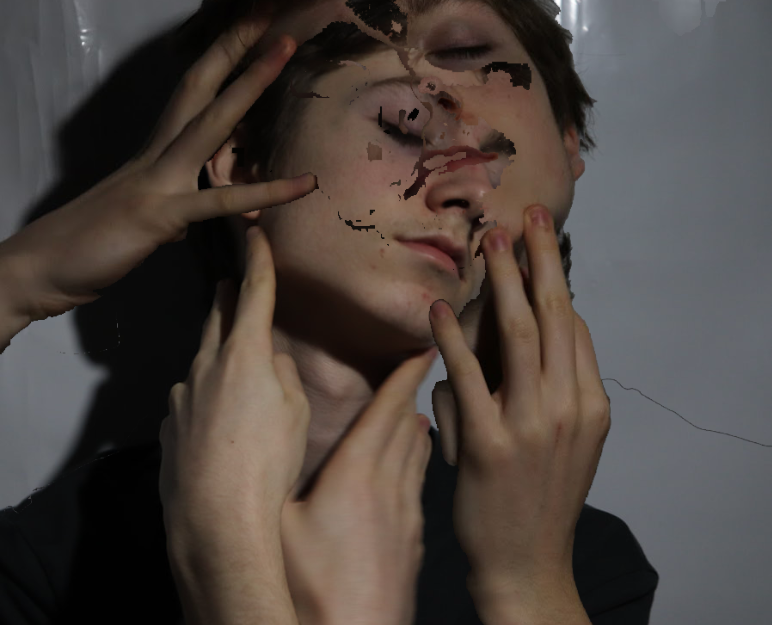
EDITED HANDS IMAGE
In photoshop I layered lots on images on top of one another and moved them around using select so they corresponded well, finally lowering the opacity on each one to achieve this effect of many hands reaching for the outside world.

I love these images so much, I achieved a suffocating effect and explored interesting techniques. I think they meet my given brief very well.
If I were to do this again I would only like a bigger surface of tracing paper to get the whole body in shot.
If I were to do this again I would only like a bigger surface of tracing paper to get the whole body in shot.
|
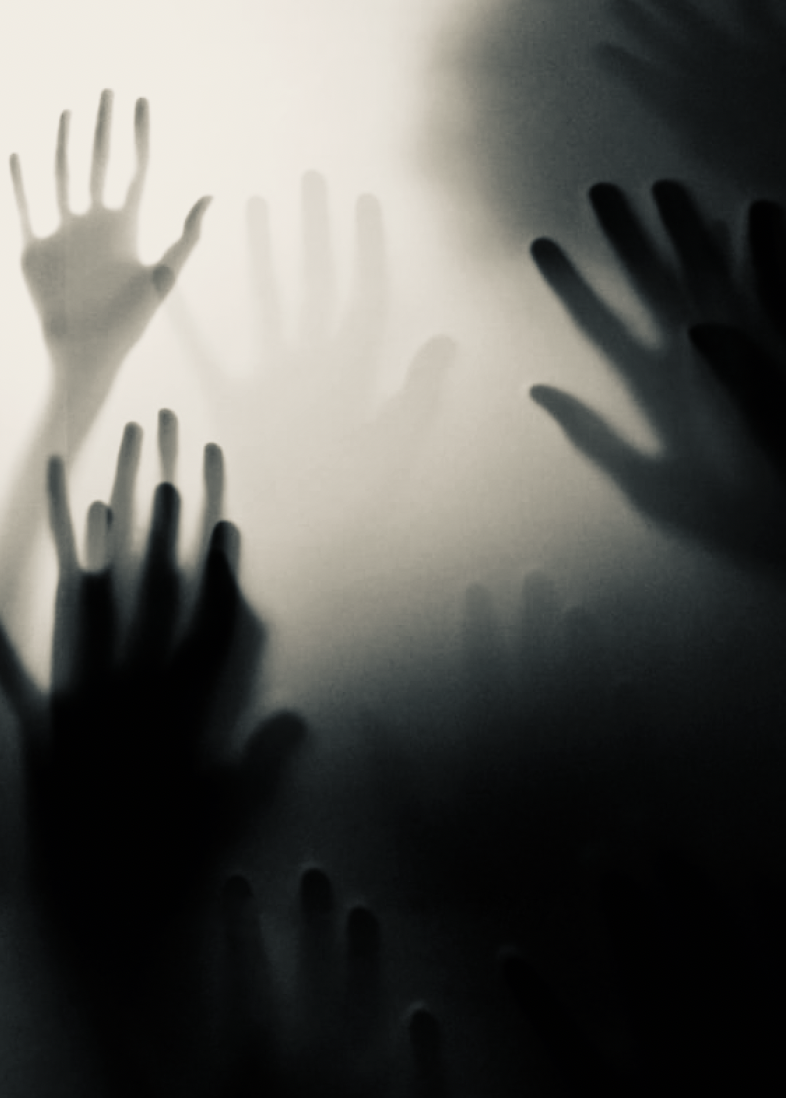
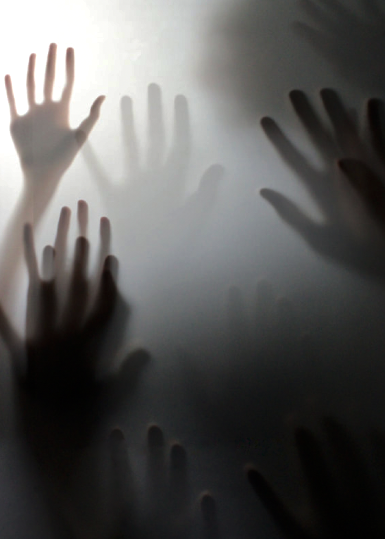
Vintage
|
Cool
|
B&W
|
THIRD RESPONSE
pintrest inspiration

|

|

|
|

|

|
I really like this idea of using an opaque door and how the images came out, there is a ghostly effect created with the hands and shadows.
I wouldn't change them, only maybe next time have a stronger light rather than just natural light behind to define the shadow.
I wouldn't change them, only maybe next time have a stronger light rather than just natural light behind to define the shadow.
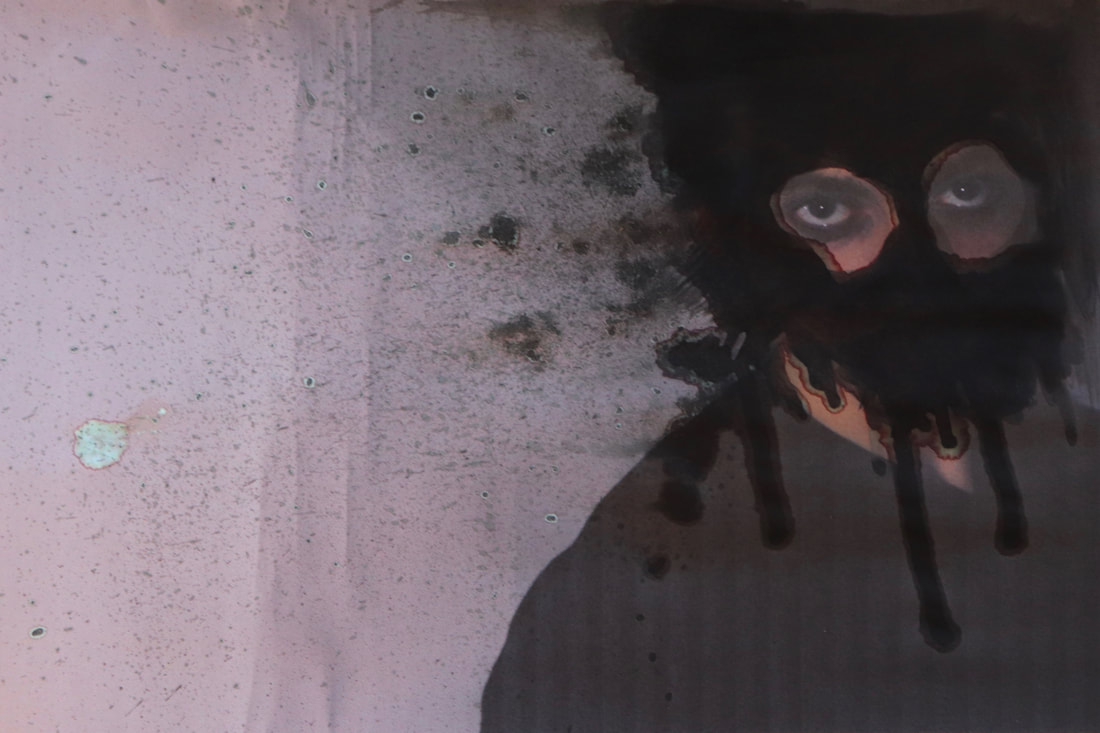
DEVELOPMENT
FOURTH RESPONSE
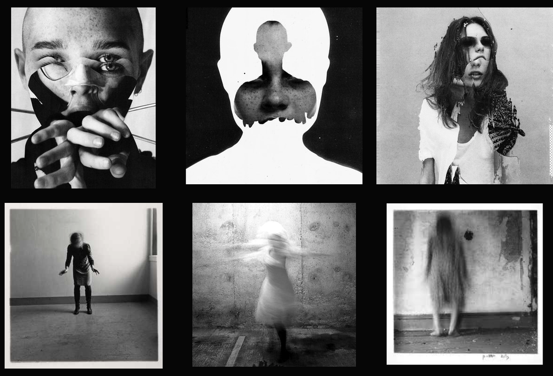
Inspiration -
JESSE DRAXLER
JESSE DRAXLER
- DIFFERENT VIEWS OF A PERSON
- DISTORTION
- DISTORTION
Jesse Draxler (1981- ) is an American visual artist, illustrator and art director. is a mixed media and multidisciplinary artist, and his pieces combine painting, photography, collage, typography and digital painting.
Among their characteristics are distorting the human form, working in grayscale, and abstract landscapes.
I find the colours and shapes really interesting and overall beautiful in lots of ways, so I wanted to recreate it in a way that were my concepts and ideas but very much inspired my Jesse.
I also took inspiration from a previously studied artist from the early 1970s called Francesca Woodman (1958-1981). She was an American photographer who used slow shutter speed amongst other mediums to create an image that appeared ghost-like.
Blurring her body to represent a confusion and how fragile a person can be, and the blur the beautiful mess inside of someone.
I personally love this concept and her work, so wanted to include it in my development photos.
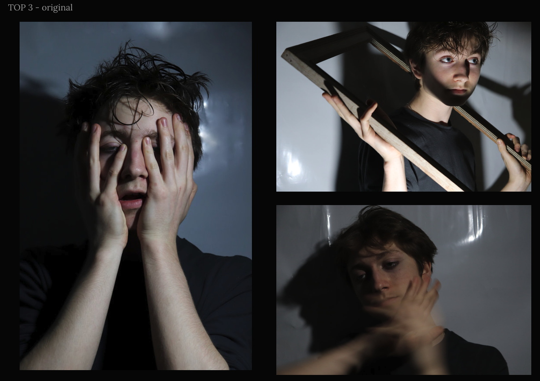
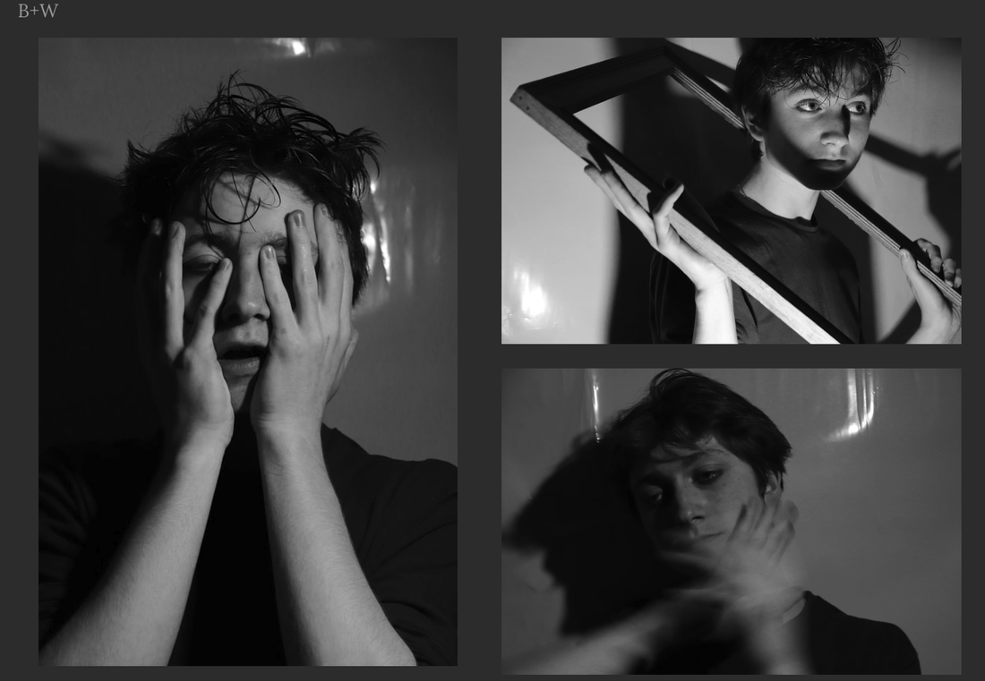
THE SHOOT
WWW - I really love the concept and the shadows within the images, the models natural face structure really matches the whole feel of Jesse Draxler. Also the use of objects to create more angles and reflections within the picture makes it more intricate and intriguing.
EBI - Some of the images could be sharper and the reflections behind the subject are distracting, but they could be edited out.
EBI - Some of the images could be sharper and the reflections behind the subject are distracting, but they could be edited out.
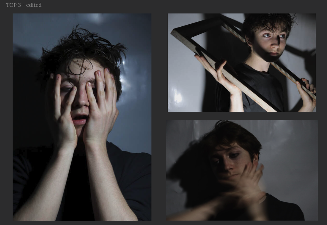
FIRST EDITED RESPONSE -


WWW - I like the initial idea and atmosphere but also feel like it can be developed more into something better.
EBI - I find it boring and not thought through, it hasn't met the brief so it feels careless.
EBI - I find it boring and not thought through, it hasn't met the brief so it feels careless.
SECOND EDITED RESPONSE -
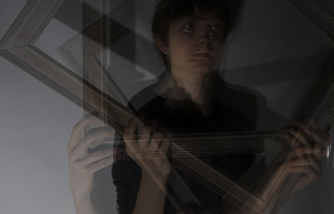
PROCESS - First I layered all the images below on Photoshop and lowered the opacity so they were transparent, then I moved and cropped the images so they corresponded in a way that was inspired by Jesse Draxler's work.

|

|
|
|
WWW - I think the idea is very interesting and creative. I also love the depth and messiness created with shadow in the final product.
EBI - Obviously the first product was an experiment, but I still think that it could have had more direction. I would have liked to print out a higher resolution image on the second one, possibly B+W for the bottom layer, and experiment further.
EBI - Obviously the first product was an experiment, but I still think that it could have had more direction. I would have liked to print out a higher resolution image on the second one, possibly B+W for the bottom layer, and experiment further.

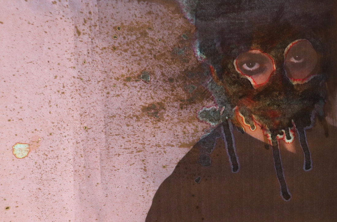
↓
|
|
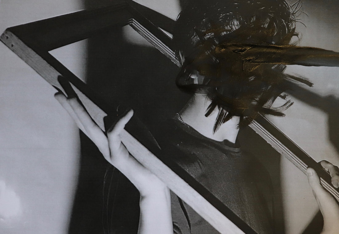
I love this response so much more, I think it's interesting and disturbing in the best kind of way. It's messy but carefully controlled so the messiness adds to the whole feel of the image. It is inspired by a Jesse Draxler image but I have put my own take on it by putting light behind it and creating specific shapes with paint.
The image on the left is in front of a solid surface, whereas the right image is in front of light, enhancing colours.
The image on the left is in front of a solid surface, whereas the right image is in front of light, enhancing colours.
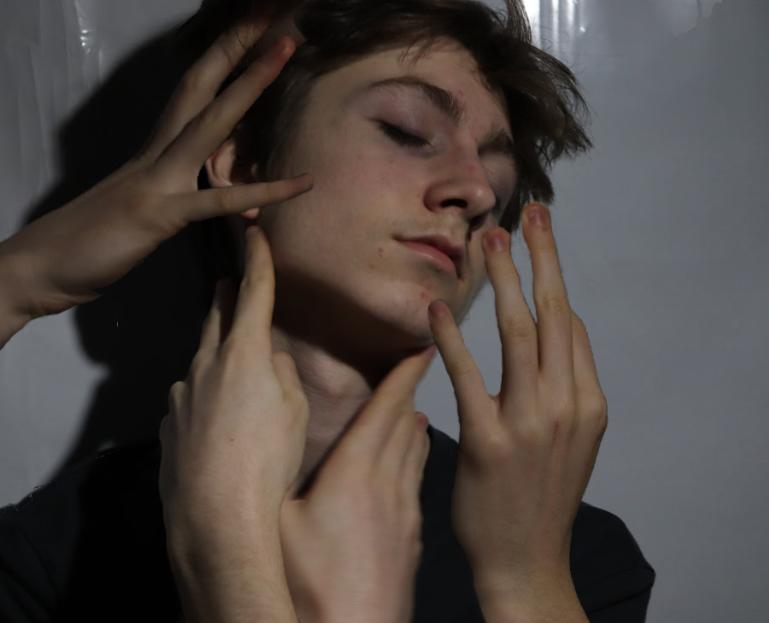
|
|
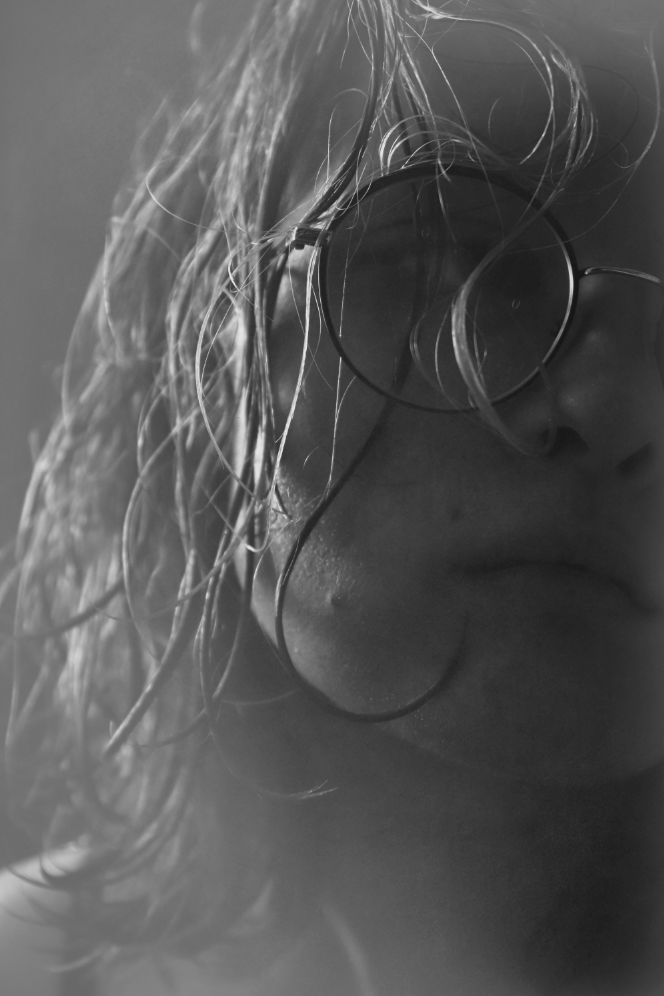
I really like these images because they make you feel strange looking at them, and I think that is the reaction Jesse creates in his work.
Hands reaching in from the outside around an innocent face is a beautiful image, then the cracked face in the second picture shows a darker side - the mask is falling apart.
This was done on photoshop with layering and the eraser and lasso tool.
Hands reaching in from the outside around an innocent face is a beautiful image, then the cracked face in the second picture shows a darker side - the mask is falling apart.
This was done on photoshop with layering and the eraser and lasso tool.
pintrest inspiration
- SIXTH RESPONSE
- SIXTH RESPONSE


I'm slightly confused with how I would like to develop my work, I have done some research on pintrest and google similar to ideas that I've considered previously.
This shoot is an experiment mostly, to see what I would like to continue with.
I used a glass sheet sprinkled with water and a light directed at me rather than from behind, pressing my face against the glass made my skin turn white and almost marbled. I really like the effect as it continues with the idea of feeling trapped but from a different angle.
I think I am going to continue with portrait as a style to shoot in, but reintroduce the ghost effect, possibly using photoshop.
EDITS

|

|

|
FINAL RESPONSE
Inspiration -
JACOB SUTTON
JACOB SUTTON

|

|

|
Jacob Sutton (1979-) is an English photographer who is known for his innovative work in editorials and film. He began his career as a fashion photographer in the early 2000’s, producing work that emphasised movement and form. This work has been featured in magazines such as New York Times, Vogue and Numéro.
He started directing in 2010, this has led to commissions from brands such as Chanel, Louis Vuitton, Calvin Klein and Nike. The unique tone and energy of this work has caused international attention.
Jacob Sutton is my new inspiration. His work encapsulates what I want to do - he captures the essence of ghosts and lost spirits. I am going to try and shoot underwater, possibly in the steam from a shower, and edit or shoot in monochrome.
Also I feel that this brings together all my ideas and my experimentation with long exposure and slow shutter speeds.
This completes my aim and vision for my development.
TWO BEST EDITS

|
|
PHOTOSHOP PROCESS -
Open your chosen image through file and create a new layer and then select the paint bucket tool and fill with white.
Then you want to change the opacity to round 50x, just so you can see what you are doing.
After, select the lasso tool and draw a rough outline of the face, making sure to keep everything you want focused inside the circle.
Right click and select feather, I found the px to work best around was 500.
Finally, go to Image and them Adjustments, set to 'Black and white' for full effect.
In conclusion, throughout this project I have enjoyed creating interesting and pleasing images. Each task has helped me develop as a photographer and improved my technical and editorial skills. Furthermore researching a variety of photographers has inspired me to create more intriguing and pleasing images, enhancing my creative abilities.
In the future I am excited for Fragments and to further my ideas.
In the future I am excited for Fragments and to further my ideas.
