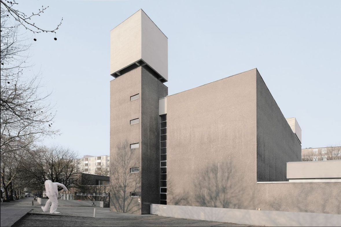
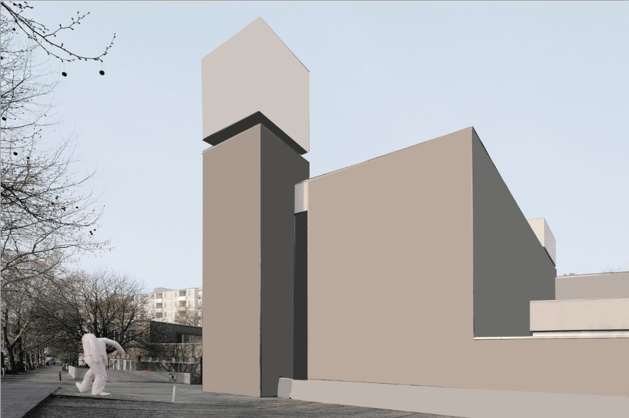
process -
Simplified architectural image
Inspiration -
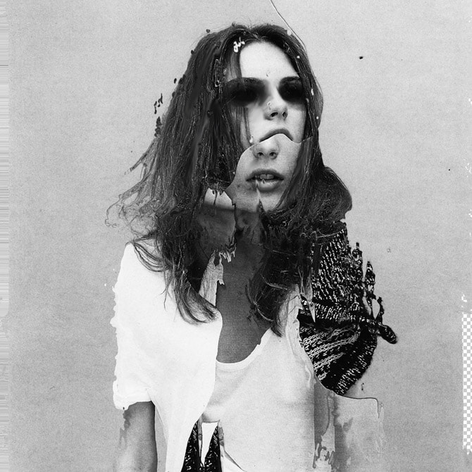
PAUL EIS
PAUL EIS


FIRST RESPONSE
|
|
SECOND RESPONSE
- colour image
- colour image
FORM OVER FUNCTION
Inspiration -
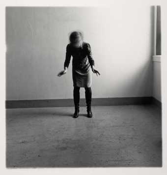
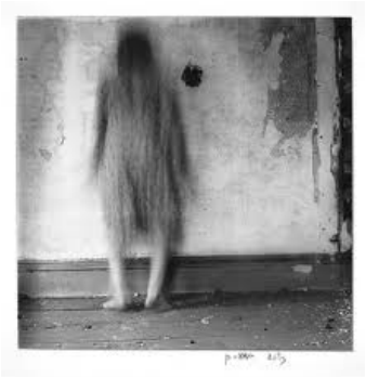
ANDRÉ KERTÉSZ
ANDRÉ KERTÉSZ


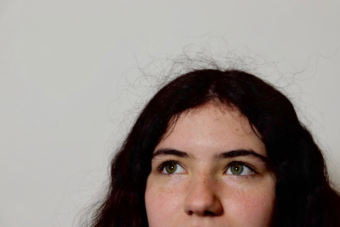
André Kertész (1894-1985) was a Hungarian-born photographer. Best known for his contributions to photographic composition and the photo essay. Today he is considered one of the seminal figures of photojournalism and is renowned for his fascinating pictures of everyday life.
We took inspiration from his use of black and white images and shadows and created our own images using the basic materials he would of had.
WWW - I completed the assignment well and created several different and interesting shadows with the artificial light
EBI - I found the compositions slightly boring and the shadows weren't as crisp as I'd like them to be
FIRST RESPONSE
TOP 3


SECOND RESPONSE
TOP 3


I love the angles and the more interesting composition of the shadows, the light is hitting and reflecting in all the right spots. As well as this, the shadows are clear and precise with different angles and shapes.
THIRD ATTEMPT
- colour
- colour
TOP 3


I think that the use of colours really make the image very different and more professional, the light reflects in different ways and creates ore shadows in intricate places.
|
I
WWW - I like where the lights hits of the shots and how it also creates a deep darkness on and behind the subject EBI - The images are choppy and uncoordinated, so I prefer them more as still images rather than a GIF but could definitely improve. |

|
ORDINARY TO EXRAORdINaRY
STILL LIFE
Inspiration -
EDWARD WESTON
EDWARD WESTON

|


|
Edward Weston (1886-1958) was a 20th-century American photographer. He is renowned as being one of the most innovative and influential American photographers in history and "one of the masters" of 20th century photography. In this collection of still life photos he used a Graflex box camera and directed light and experimented with now objects/food looked under different angles and lighting.
We attempted to do the same thing with a different array of objects, using torches and a black background.
WWW - I really like use of natural light and the composition and focus on the images, I think its interesting and creative.
EBI - Some of the shots are not quite in frame and have a section where you can see the room behind, it looks unprofessional and distracts from the subject of the picture.
FIRST ATTEMPT
- natural light
- natural light
TOP 3


B&W


I edited these in photoshop, simply just changing them to black and white with the filters tool and then moving around some of the setting including; dark spot, brightness, highlights etc. To create an image that was engaging and I was happy with.
SECOND ATTEMPT
- artificial light
- artificial light
TOP 3


B&W


I edited these image the same I did with the first response, in photoshop trying to produce an interesting image and improve lighting etc. But no adjustment were made to the actual image, only b&w and highlights etc.
WWW - I much prefer the artificial light to the natural light, it makes the images especially spooky because I lowered the brightness so when the torch shines on an object it creates a very dark background and defined highlights, which i thought was very interesting.
EBI - In contract to my first point, I think that some of the images are a bit too dark so the object looses its definition, also in one of the image you can see m partners finger.
EVERYDAY SCULPTURES
Inspiration -
SHARON RADISCH
SHARON RADISCH

|

|

|
The New York based photographer Sharon Radisch, created a series of still life sculptures in response to the covid-19 crisis. These consisted of simple objects that she had found around her house, balanced atop one another to create a more interesting image.
Sharon is renowned for her clean aesthetic and muted colour palette, with photographic work that spans fashion, still lives, travel, and interior design.
She stated during the pandemic “During my quarantine—almost 6 weeks now—I have been exploring my work and what it means to create during this time with limited resources”. Like she said she had "limited resources" and could not create her typical photography with models, she only had her home, so as a result she saw this as an alternative.
Radisch uses a white background with a sculpture centred which she makes out of various different objects, we tried to recreate this using the same method in the classroom.
WWW - I like the placement of the objects in most images and the sharp angles and lines in the first image of my TOP 3.
EBI - The lighting can be improved on this response, a few of the images are too dark. As well as this I think that some of the images are too chaotic and don't match the artists simple work.
FIRST RESPONSE
TOP 3

|

|

|
SECOND RESPONSE
TOP 3

|

|

|
WWW - I think my work and the artists correspond very well, I also like the simple composition and the lighting.
EBI - Some of the images have a specific focus point, so you can see some of the image out of focus,
EBI - Some of the images have a specific focus point, so you can see some of the image out of focus,
SIMPLIFIED STILL LIFE
Inspiration -
MICHAEL CRAIG MARTIN
MICHAEL CRAIG MARTIN

|


|
Michel Craig-Martin (1941- ) is an Irish contemporary conceptual artist and painter. Over the past forty-two years he has had numerous exhibitions and installations in galleries and museums across the world, including the Centre Pompidou, Paris, and MoMA, New York.
He is known for is simple but intricate work with objects and block colours and his clever use of corresponding colours make them pop against one another.
Most of his images are digitally edited from an original drawing, we tried to recreate this in photoshop with a photograph instead.
WWW - The colours are clear and bright, as well as being opposites on the colour wheel so they could correspond to one another well.
EBI - Some of the edited colours go out of the lines, and I made the colours opaque because I think it looked better but it doesn't completely match the artists work.

|

|
HALF TERM WORK - KITCHEN SINK
STILL LIFE
Inspiration -
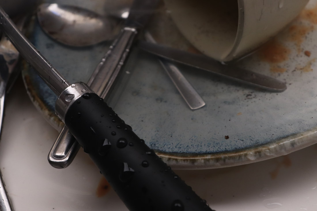
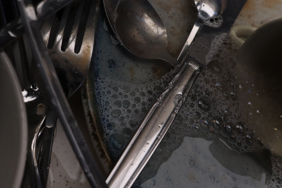
JAN GROOVER
JAN GROOVER


Jan Groover (1943-2012) was an American photographer is renowned as one of the best still life photographers since the medium’s invention.She received numerous one-person shows, including at the Museum of Modern Art in New York, which holds some of her work in its permanent collection.
In 1978 an exhibition of her dramatic still-life photographs of objects in her kitchen sink caused a sensation, this is what we based this work on.
I placed a number of dirty kitchen utensils in a sink and looked for interesting patterns or shapes within the scene, often trying to use different shadows and create new light reflections. I started shooting with a high exposure but then switched to dark and quickly realised that I preferred it because it created more atmosphere within the image.
WWW - I really like my top three images, I think they have intriguing reflections and shapes.
EBI - Some of the images were boring and unfocused.
|
|


|

|
FIRST RESPONSE
TOP 3
EDITED
SECOND RESPONSE


|


|
EDITED

|

|
In conclusion to this section of work, I think I edited the images well and improved technically with the second response. Although if I was capturing a person within a photograph and their personality I think the first response shows that more than the second, but the second response is more technically advanced.
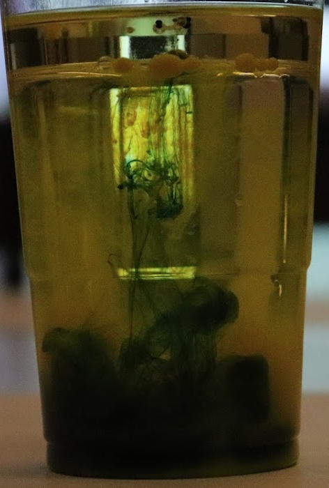
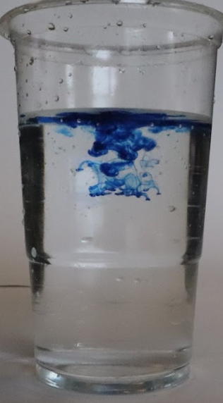
fireworks in a jar
Inspiration -
ALBERTO SEVESO
ALBERTO SEVESO

|
|
|
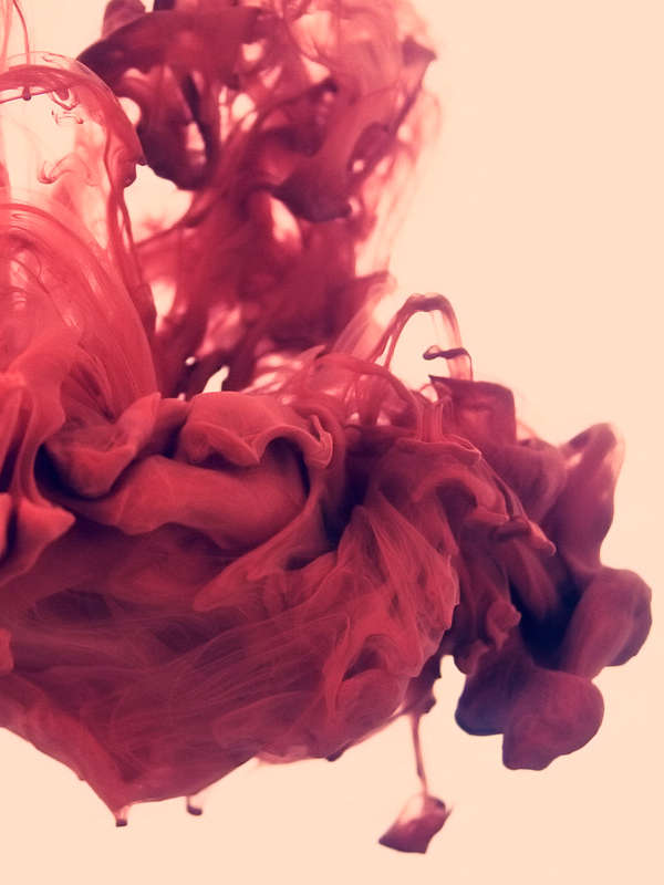
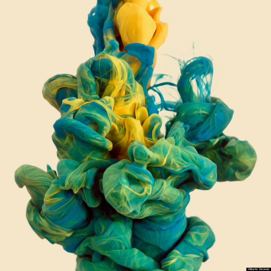
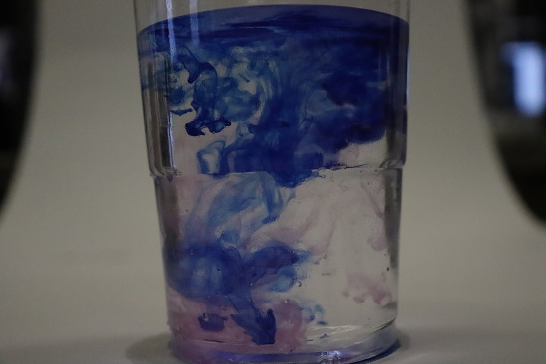
Alberto Seveso (1976- ) is an Italian graphic artist illustrator and digital photographer, who was first inspired by artwork on skate decks and music album artwork.
His unique pieces have been featured on the covers of magazines and CDs around the world, and he's collaborated with big names such as The Temper Trap, amongst many others.
We took inspiration from his work with ink and water, this is where he uses a high resolution camera to capture the intricate moments when coloured ink hits water, we tried to do the same.
FISRT ATTEMPT
|
INK FLOWING GIF ATTEMPT -> WWW - The transition is smooth and precise, and the camera shot is even and not choppy. EBI - The GIF is a bit dark and could be enhanced with editing. |

|
TOP 3 FROM SHOOT

|

|
|
WWW -
EBI - These three could be improved with lightening in photoshop
EBI - These three could be improved with lightening in photoshop
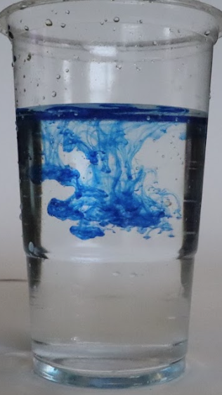
SECOND RESPONSE

|
|

|
WWW - I captured the ink falling really well, the images are crisp and interesting.
EBI - I also think that they are a bit too dark, same as the first response, I think they could be improved with lightening.
EBI - I also think that they are a bit too dark, same as the first response, I think they could be improved with lightening.
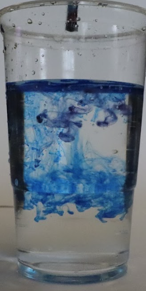
THIRD RESPONSE
|
|
|
In confusion to this assignment and this third response, I think that I learned from my mistakes and ended up with some bright crisp images that corresponded to the brief really well.
SEQUENCES
Inspiration -
LUKE STEPHENSON
LUKE STEPHENSON

|

|

|
FIRST RESPONSE
SECOND RESPONSE

|

|
|
|

|
|
TOP 3
EDITED
|
1
|
2
3
|
|
1
|
2
|
3
|
B&W
physical response
FIRST ATTEMPT
FIRST PRODUCT FINAL PRODUCT
FIRST ATTEMPT
SECOND EDITED RESPONSE
FIRST ATTEMPT

|

|
SECOND ATTEMPT
EDITED
|
1

|
2

3

|
|
1
|
2
|
3
|
